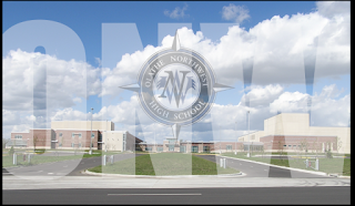
 This week we have been working on Photoshop. For this first image I had to resize the background and add a compass layer. After we added the compass we had to use the magic eraser to get rid of the white background. Then we centered the compass in the middle and put the opacity at 70 percent. After that I typed the word "ONW" in white with 360pt font. The font type is Impact. I centered that and then set the opacity at 60 percent. It sounds easy but, it took me a while to get it done.
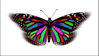
  This second project we practiced using the magic wand, hue adjustment, and the clone stamp tool. First I had to open a copy of the butterfly and set my background to white. Then I changed the canvas size. I selected symmetric areas from the wings and used the magic wand and adjusted the hue. I kept doing that until I had all different colors. I then used the clone stamp tools to imitate a fluttering butterfly. Thats it!
This next project took me the longest. I had to open a picture of the school and resize the image. I then had to make a test mask that says "Northwest" in 150pt Impact font. Then when you commit it the text will go away and then the letters will be selected. I did command-shift-I to invert. It selected everything but the letters. Next, I switched to the gradient tool and made a new layer and used the colors black and raven blue. Holding down the shift to constrain the gradient I drew the gradient from top to bottom. Then deselected. On the layer with the gradient I added a layer effect with a 1px white stroke and thats all!
This last one was fun but, it took a lot of time to complete. I opened the background and had to use the clone stamp tool to get rid of two light posts and a car (that took me the longest). Then opened a picture of a raven and used the magnetic lasso tool to cut out the ravens head(this tool is very touchy and messed my picture up a lot) . I copied the raven head and pasted it on the school background. I changed the opacity of the raven. I did the same thing to the school hallway, administration office, and the stairs. All changing the opacity so they would blend. I rearranged the pictures how I liked them and then I was done!


Comments
Post a Comment